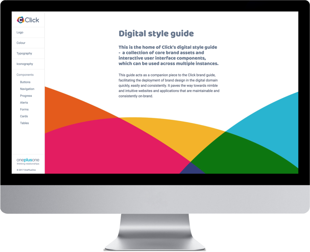
We created and launched a compelling, digital-first brand for OnePlusOne, expanding their reach and communicating their purpose in a powerful new way.
Wanted: an outward-looking brand to engage the public
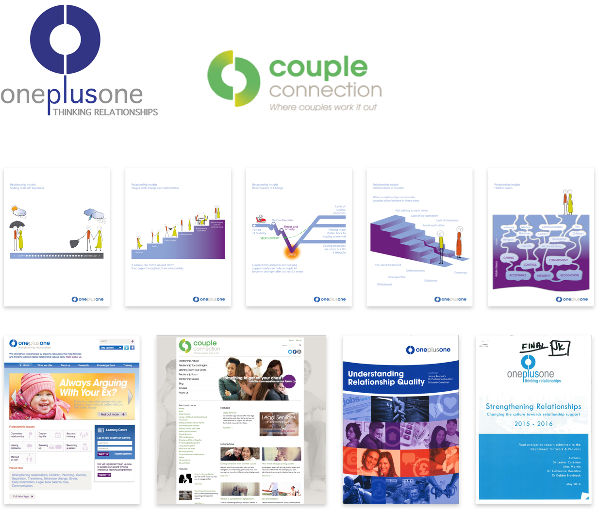
In less than two decades, OPO built a respected presence in government and across the third sector. But they were less able to engage audiences in our noisier, digitally-oriented public sphere. Their online content didn’t grab users’ attention. They struggled to manage a multitude of sub-brands and sites. The result was service fragmentation and unnecessary expense.
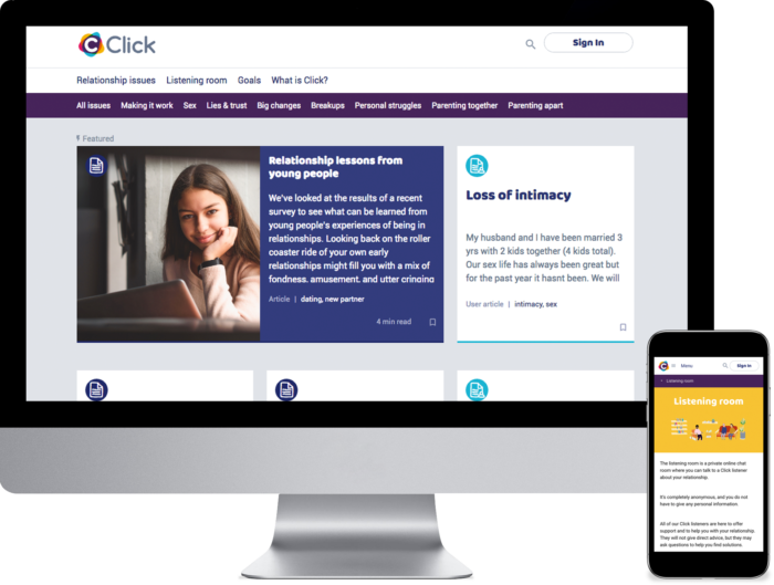
They sought to build relevance with a new digital-first, public-facing service. They envisioned a “relationship gym,” an online platform to consolidate their research and expertise within enticing content, including sticky activities like quizzes and goal-setting programs. The aim was to encourage users to return to the platform time and again, at home or on the move — a “Fitbit for relationships”.
A big question remained. Should they create an entirely new brand, or embed this service within a revamped OPO brand structure? We led them on a brand transformation journey to a refreshed position every employee and stakeholder got behind.
An iterative journey of discovery
With close listening, design audits, research and competitor analysis, we charted OPO’s existing strengths and aspirations, and the reach of their brands, assets, and positioning. We recorded the research journey using the Playback Method and over time, played back the story as we built it.
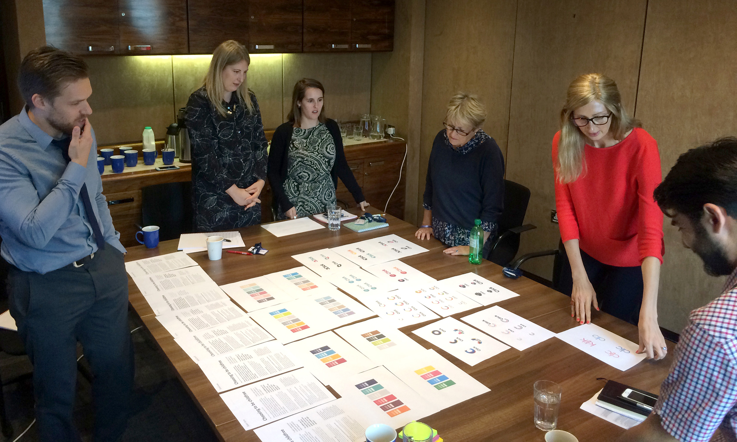
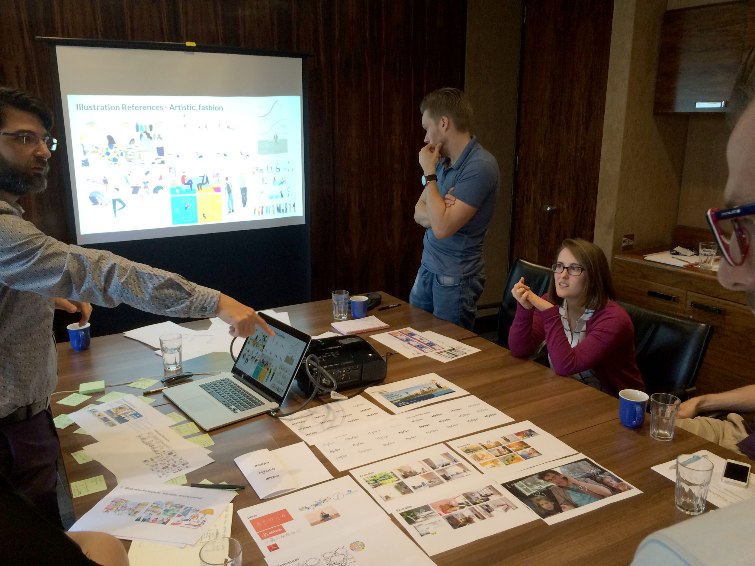
Inclusive, engaging workshops helped staff open up, to vocalise their thoughts on the DNA of a new public-facing brand and how it should relate to OPO. We debated pros and cons of every idea and direction, brought our research and thinking to the workshops, and iteratively played it back for validation and evolution. The Playback Method revealed challenges and opportunities quickly, making the process open, inclusive, visible and collaborative. It motivated stakeholders to participate, creating a shared common brand story resource.
It has been a pleasure working with you all, the passion and commitment to the project's purpose has been infectious. The process was inclusive, enjoyable and helped align our different team's ideas and perspectives. I am really excited about the opportunities this new brand will bring for OPO.



Positioning, creative direction and a better brand story
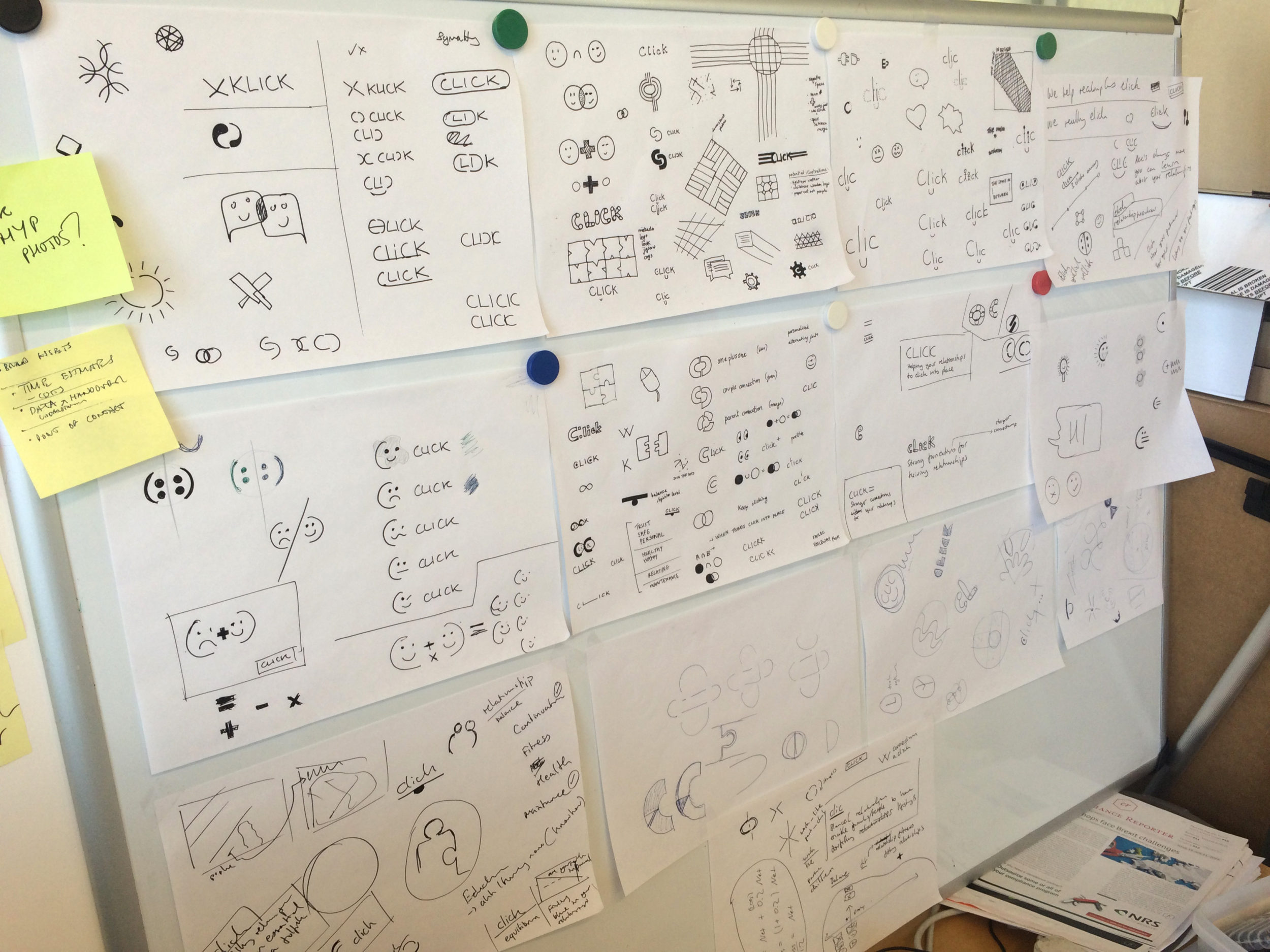
Historical pedigree suggested OPO should remain as the brand to face government, funders and social services. The public face would live behind another brand, an online service hub that was initially nameless. Our Playback Method allowed us to explore the brand positioning and entire story without a name, allowing other workstreams to progress while a name was defined. Through this, we unlocked ideas beyond the initial brief, without ever losing project momentum.
It became clear to us that the charity would benefit by shifting focus from “couples” to all “relationships”. This powerful realignment opened up more audience engagement potential and a broader, SEO-friendly content architecture that would reach many more people.
Once the positioning, direction and name Clicked into place, creating a holistic picture of what this brand could sound and look like, we entered the design phase.

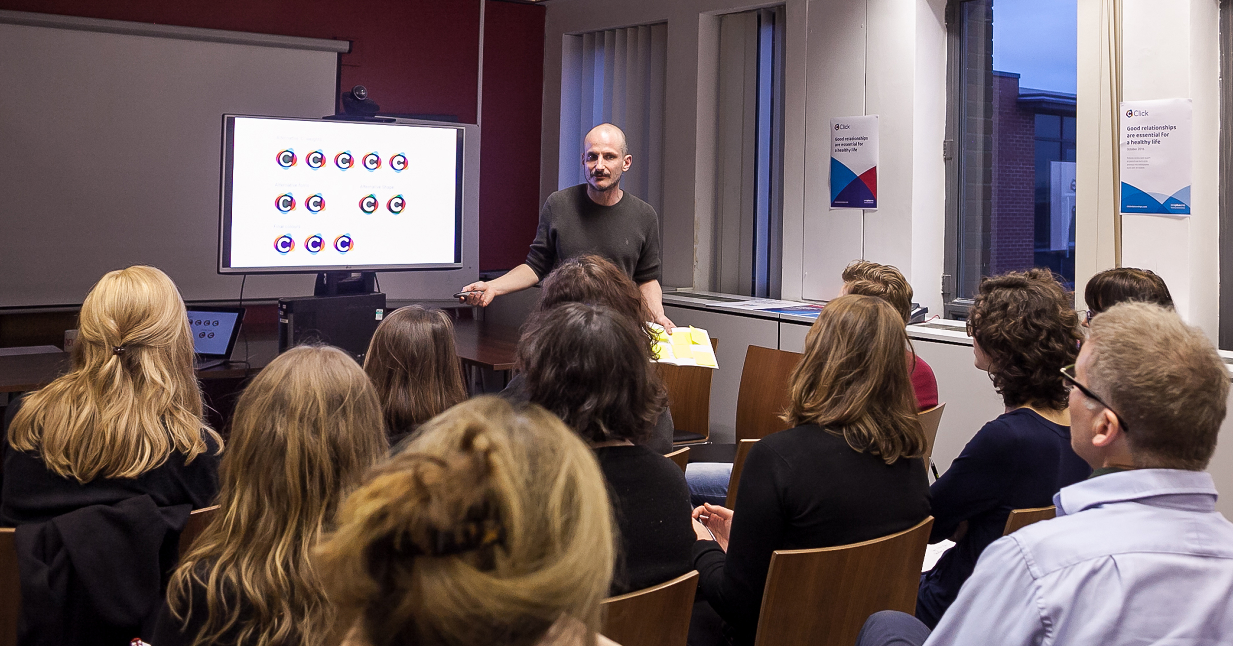
Playfields demonstrated that they clearly understood our position, our history and our pain points before any of the design work took place. That’s quite a rare thing - most people don’t get us.
From story to brand and design system
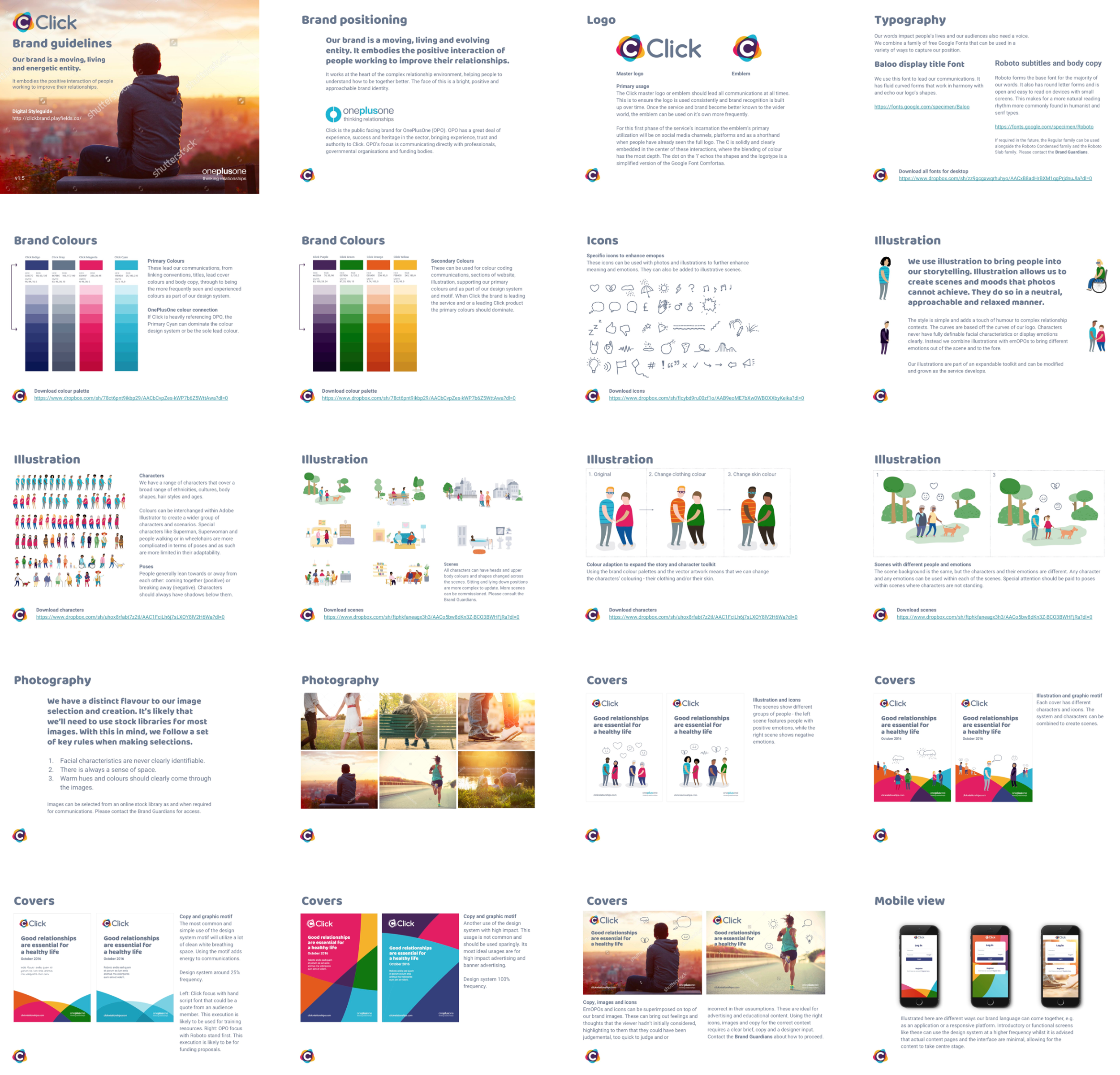
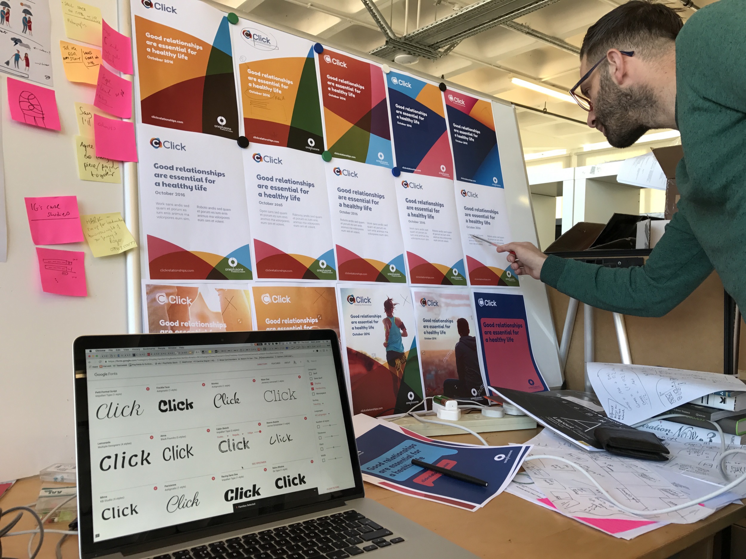
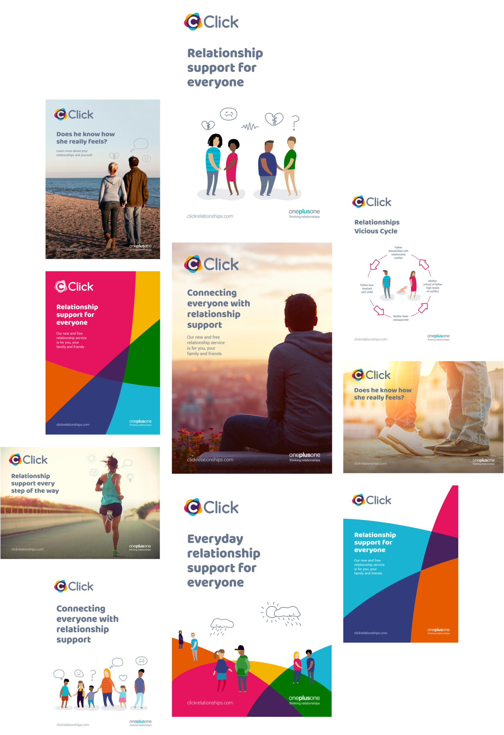
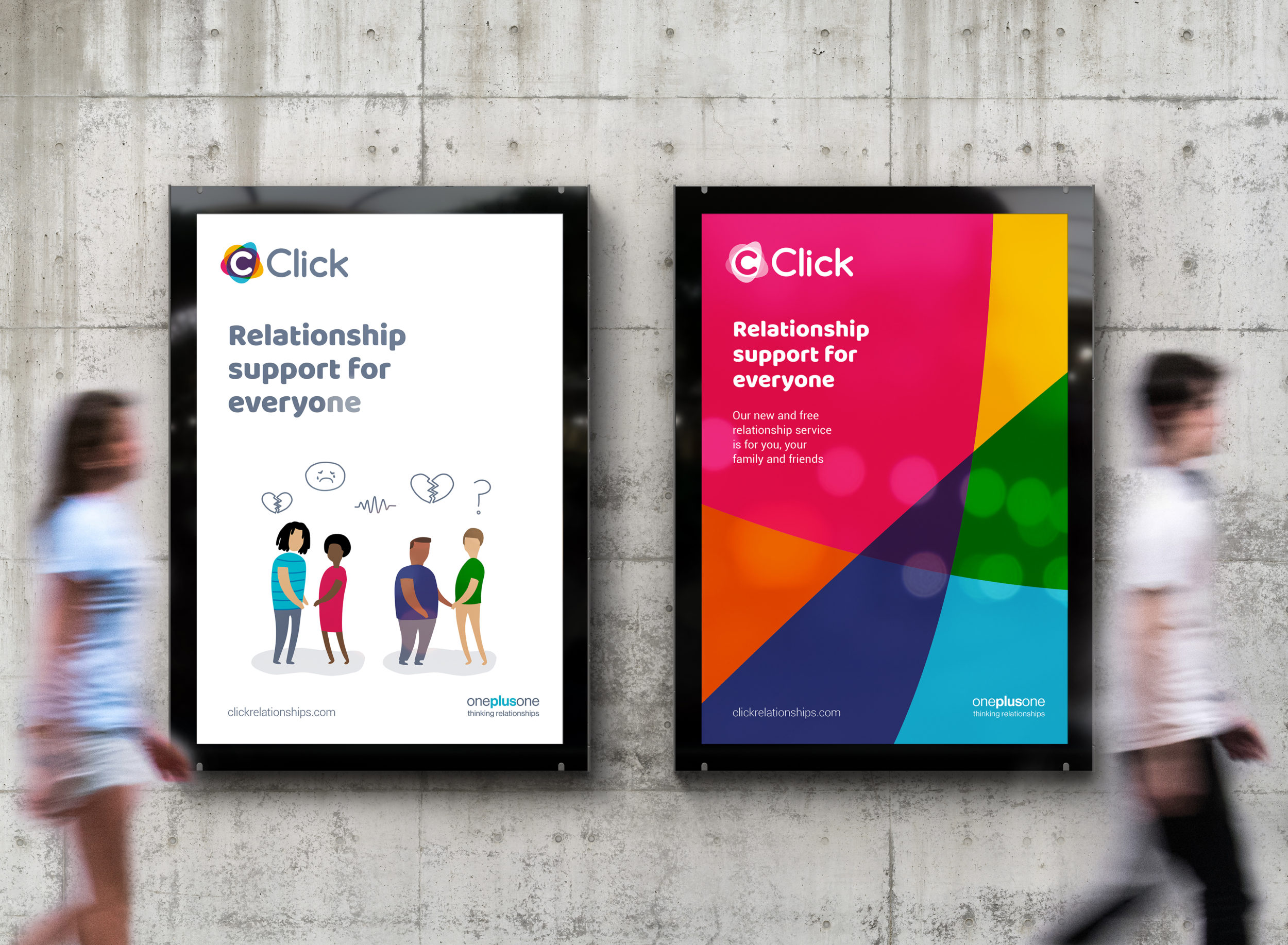
Click must be universally relatable. Friendliness and inclusiveness are communicated by warm, arresting colours and fluid sans-serif typography. The design system unites different brand conventions, so the Click language can naturally adapt to audience and context. The strong brand motif uses parts of the logo at different frequencies; solid colours for advertising, clean minimalism for reports. Stock photos of people often stir an audience’s unconscious biases, because we all relate (or don’t) to whom we see. In our carefully chosen Click images, we never see actual faces, yet instantly understand the unspoken emotions in the scenario through the inclusion of drawn emoticons.
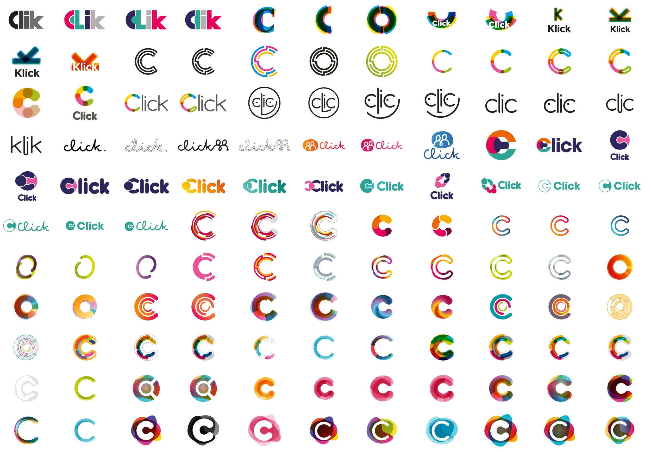
For the logo, organic shapes (people, emotions, cells) work together, interacting, “making it click.” Life and movement within the logo’s shapes imply relationships being “exercised” and service users getting “fitter”. They also suggest the positive feedback loop between user data and service use. Researchers monitor actions and preferences, an interaction which propels Click to continuous improvement. As you use the service, you also improve it.
An illustration toolkit with infinite scalability
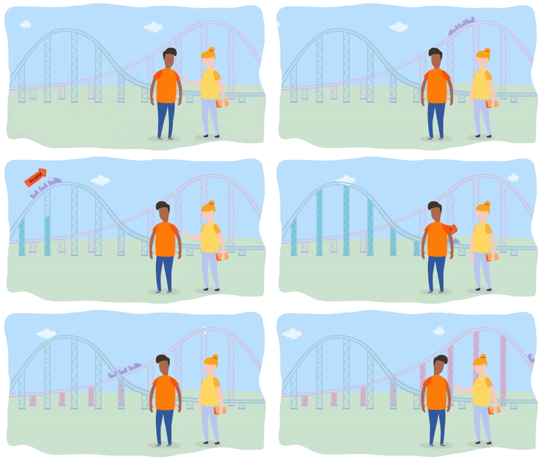
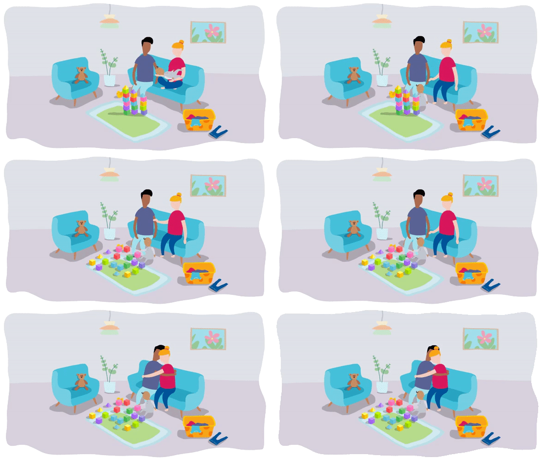
Click’s illustration toolkit captures real-life situations without showing facial characteristics or expressions, so observers don’t prejudge their character or emotions. Instead, customisable illustration and emoticon sets (“emOPOs”) convey the complexities of emotion in a simple visual language. Characters from our toolkit can combine in different ways, and with different icons, to illustrate moods, ask questions or make infographics.
This illustration toolkit is infinitely scalable, expandable, remixable and suitable for any channel. The charity can now expand and populate new content easily with bespoke, on-brand visual content. Click’s potential illustration library is literally infinite.
We've been really pleased with the truly excellent work Playfields have done for us, and very much look forward to Click becoming a real thing.
Repositioned for expansion
OPO is now equipped with holistic, intuitive positioning guidelines and a flexible, impactful design system for all their applications. Our final delivery included online brand guidelines and design system to articulate purpose and positioning; conventions for print and digital outputs; and sample brand outputs. We worked with an external development partner and trained internal staff to use the guidelines and illustration toolkit.
We boosted brand rollout, including by replaying our process and story to everyone at an internal launch event. The branding process supported OPO’s transformation to a digital-first service provider with a brand identity that resonates. Everything has really… Clicked.
